Event
The fourth The North Wales Print Fair will be held at Mostyn on Saturday March 4th.
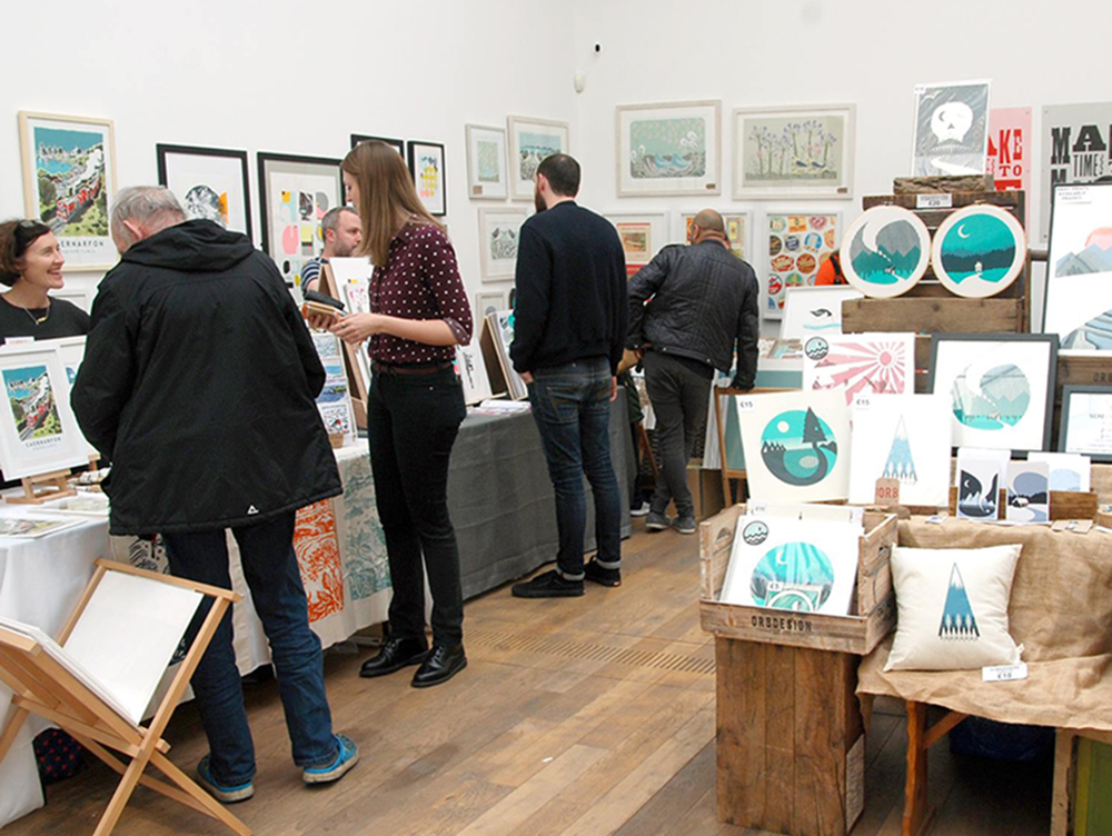
Organised in partnership with The Regional Print Centre, Wrexham, with free entry for visitors, it’s a fantastic opportunity to buy beautiful and affordable art directly from artists.
We’ll have over 30 stalls, printmaking demonstrations through the day, free print workshops for all ages and a prize raffle. Our Siop will be open as usual, and our café will also be open all day for locally roasted coffee, delicious cakes and light meals.
About the Regional Print Centre
The Regional Print Centre is an artist focused organisation based at the print studio in Coleg Cambria, Wrexham and offers a variety of creative printmaking opportunities which includes open access, workshops, courses, and demonstrations.
The Regional Print Centre is a joint project funded by Coleg Cambria in Wrexham and the Arts Council of Wales.
Artist profiles and statements
Abby Sumner Design

“I’m a multidisciplinary designer and printmaker, specialising in risograph printing. I create colourful eco-conscious work from my home studio which houses a MZ770e risograph printer named “Maz”.
I create a wide range of risograph prints, stationery, greetings cards, washi tape, calendars, screen printed tote bags and paper goods. My work is greatly inspired by architecture, geometry, typography and pattern.
Within everything I create I’m incredibly environmentally conscious and aim to ensure my work has as minimal impact on the planet as possible through the selection of materials and processes.”
Ann Bridges
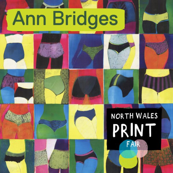
The stencils are also used as a guide to removing ink when wiping or rubbing back to the picture surface.
Detail is produced by drawing onto card shapes (the inside section of the stencil).These are inked up and printed on top of the stencilled areas. I also draw directly onto the paper surface during the print process.
I rarely use a printing press, preferring to use hand pressure or a light use of a roller on the back of the printing plates. Meticulously hand printed, each image will have variations in colour.
Most prints are one-off (unique), others are produced as a small numbered series.
rfhardy

I’m a visual artist and maker from Bethesda, North Wales, and a member of Oriel CARN in Caernarfon, an artist-led network and gallery. Recently I won an honorary Eirian Llwyd Memorial Award for my screen-print artworks. The award supported my place on the “Introduction to printmaking” course at the Regional Print Centre, Wrexham, and allowed the purchase of art materials and screens to further my practice.
Beth Knight Art

I strive to create pieces with depth and atmosphere, developing techniques to capture light, distance and detail, pushing the boundaries of what is expected from lino printing. Producing work that evokes and captures our emotional connection with our landscape I hope to draw the viewer in so that they can imagine being there and feel the atmosphere of the moment.
Charlotte Baxter

Charlotte works primarily with lino and woodcut and the printmaking process itself greatly influences her work with each element bringing its own exciting opportunities-most notably the unpredictable results that can be achieved through building layers, pattern and texture within her prints.
Ellie Cliftlands Printmaker

Ellie initially began to experiment with woodcut whilst at Duncan of Jordanstone College of Art and Design in Dundee but it was during her MA at the Cambridge School of Art that her work became increasingly detailed, as she explored engraving as a means of book illustration. Whilst there, Ellie was lucky enough to be introduced by her tutor to John Lawrence, who previously had been a lecturer at CSA. Ellie was a recipient of a Society of Wood Engravers’ Rawlinson Bequest grant for her final MA project, an illustrated edition of the Grimm tale, The Juniper Tree.
Elly Strigner Illustrator

Emma Grover

The themes of the work are treated in a similar way, observations and thoughts are layered to create different levels of meanings. The work documents the day to day, events, people, nature and things that are common to us all however the characters that emerge from these evoke a more sinister world of imagination and fiction.
Estella Scholes

My work is mostly abstract, exploring shape, colour and texture of weathered surfaces found on the North Wales shoreline or in ancient manmade landscapes. ‘Imaginary Archaeology’ is a current theme.
Print Garage

The image generation is a slow process of experimentation, of trial and error; collecting imagery, developing patterns and overlaying all the different elements until new and intriguing relationships emerge. The results are brightly lit beacons of balearic zen shining out amidst a visual, digital landscape that is in constant upheaval, upgraded and updated daily.
Iain’s work borrows language from other art forms, film and photography, poetry, electronic music and rave culture – amalgamating, mixing and remixing, offering up familiar signs and signifiers but now refracted and reflected, illusive and allusive, all lightly seasoned with a slightly understated degree of subversion. Layers of fragmented iconography and geometry coalesce on the paper, like motes of dust trapped in a beam of light teasing us with a cheeky glimpse of a much bigger gestalt.
The resulting collection is a series of paeans to pigment, a psychedelic hallelujah to the handmade and handprinted, colour and tone poems that are a tiny bit joyful.
Jacqui Dodds

Using silkscreen, linocut and blind embossing I distill memories of places visited and objects within them. Colour plays a significant role, whether subtle or vibrant. Using a limited palette or leaving areas untouched, I explore space and mood within images. Surfaces of my screenprints show layers of solid and transparent elements.
In contrast, my intricately carved blind embossed prints are devoid of colour, whereby the paper plays a significant role, revealing form and texture through shadow and light.
James Green

Julia Midgley

People, artefacts, sculpture, art history, the bizarre, and horses all feature in this collection ofresource material.
My underlying theme is “truth being stranger than fiction”. The works aim to entertain and intrigue. Editions are produced in my Cheshire studio.
Etching is an ideal technique for someone like me whose primary medium is drawing. Line quality is changed by the printmaking process, often giving more impact to tonal areas than that achieved in drawings on paper. It is an excellent medium for linear images and thus a sympathetic vehicle for drawing.
Linocuts and monoprints are also produced. Here flat colour can be used as opposed to the more subtle tints associated with etching.
LocalHotelParking

Liz Toole

Working and traveling in Africa has informed and inspired Liz’s work, this is where she fell in love with nature, mainly birds, following her ceramics degree.
Liz uses birds to tell a story which is usually something that has happened in her life, she aims to create a positive story.
All of Liz’s screen prints and linocuts are designed and hand printed by her using specialized printmaking papers.
Colour plays a huge part in Liz’s work, she has been known to test print 60 different colour combinations for a two colour screenprint, waiting for that eureka moment.
Liz’s love of printmaking is because she is continually learning, this keeps it exciting and fresh. Liz also hand prints a range of greeting cards and eco-friendly notebooks.
Marian Haf

Alternative Photography

Freshmattic Ltd

I create pop art influenced by 70s comics, music, horror, folk stories, beer and wizards.
All of my work is hand drawn and hand printed based on my original artwork. I create prints, posters, notepads, stickers, badges, beet mats, t-shirts and other goods.
Mockup Goods Co

This background in architecture still influences my work as a lot of my prints are inspired by old technical drawing manuals and isometric illustration.
I’ve always been obsessed with old matchbooks, pamphlets and print adverts which is why I love Risograph printing so much as the textures and colour offsets inherent in Risograph printing always gives the print the looks and feel of something that was printed 30-40 years ago.
Moss Carroll

Travelling for inspiration and drawing from my observations, I direct my work as a poetic narrative of the landscapes I pass through. Much of my work derives from sketches from life. Through my monotype and chine collé printmaking process, I abstract this source material. I look under the surface, focusing on the phenomena of light, the elements and the effects of the passage of time, dissecting the landscapes at their seams, extracting colour and form, and re-assembling them into a vision beyond the physical.
OR8DESIGN

The nature of screenprinting helped to inform the signature OR8DESIGN style, using the fewest colours for the greatest impact. Even after 10 years of printing, the delight of lifting the screen on the final colour and seeing that the print has been a success has never gone away for Owen.
Owen is passionate about everyone being able to own and enjoy hand-made art and so his work is printed as open-editions and priced affordably.
Pat Mowll Art

The different elements of breaking the image down into its component parts, precise carving and then ink application, a layer at a time, each image slightly different to the last, is magical to me.
Arboretum Print Co

I love to experiment with processes and colour. I like to use colour to create other moods and feelings. It can be calm serenity or pure joy. I love the quality of the unplanned marks and colour on my backgrounds against the flat solid colours of the print.
Philip Dare

Rach Red Designs

Inspirations range from mid century design to nature tables, travel posters to fairy tales. Most images come from personal experience and wildlife sightings, which seems to key into other peoples’ connection to places and to the natural world.
My prints are evolving to mix printmaking techniques in one print.
Rhi Moxon

Printmaking forms a large part of Rhi’s practice not only for the beauty and possibilities of the technique, but also for its inspiring role in the democratisation of the arts, with its possibilities for reproducing artworks for wider distribution. Serigraphy is Rhi’s preferred medium for the infinite possibilities it allows in the layering of colour and texture, she is drawn to the visibility of the ink on the page and the flatness of colour. It demonstrates a tactile alternative to the more commonly employed digital form.
Rhi’s work reacts to ideas of people, place, language and culture often taking the form of layered maps, prints, books, with a particular desire to capture and explore domestic traditions and ‘people’s history.’
Rhi states that “Geography is a huge factor in my practice; through my work I attempt to capture the essence of a place, or at least, of my experience of it. For this reason, travel and research are central to my work. I am interested in the way in which illustration and printed matter can bridge the divide between cultures and so my practice therefore often takes the form of illustrated books, maps and recipes, inspired by my own journeys and discoveries”.
Ruth Green

The prints are all made by hand, using Fabriano watercolour paper. This surface has a silk-like quality and holds the colour beautifully. It’s also acid free, which means it doesn’t fade or discolour.
Each design is made in a small edition. The prints are individually numbered and signed. Once an edition is sold out, Ruth adapts some of the images for her range of greetings cards.
Ruth trained as a textile designer in Liverpool and Birmingham, after which she worked as a freelance designer and illustrator. Clients have included Ikea, Sainsbury’s, Waterstones and Marks and Spencer. She has worked extensively with Tate, writing and illustrating 3 children’s books and a designing a range of toys, clothes and tableware.
Her prints focus on plants, gardens and animals with a nod to mid-century design. There is a strong illustrative style, with bold colours in contrasting layers.
SANS Studio

At the studio you will find a mix of Pop Art and Punk inspired work, fuelled by a love of vintage books, analogue photography, and old band merchandise. Alongside this, the studio offers creative and commercial printing, working with other indies and small businesses. I source what I can locally and treat materials with care and passion; keeping everything I do both honest and affordable.
Screen printing lies at the heart of the studio, with designs combining a mixture of bold imagery and vintage graphics – pop art with a DIY twist! My products range from unique screen prints, hand processed and printed 35mm photographs, record sleeve notebooks, greetings cards, mixed media collage artworks, hand printed t-shirts and tote bags.
Stuart Brocklehurst

Linocut, Wood Engraving and Mezzotint form the main focus of my work, all of equal importance to my practice. My linocuts are decorative with an emphasis on colour, pattern and composition. Mezzotint allows me to work in a more personal, expressive way to capture the mood and atmosphere of the subject.
Tara Dean

Producing work created from many parts of the original line, generating a collage of elements. Layering creates a way of illustrating patterns and redefining the value of line work. Making stencils and building images from the textured shapes, offering alternative interpretations of the original marks. Tara describes it as almost drawing with the screens.
The Way to Blue

I studied Visual Culture at Brighton University and have since explored many different art forms. As an artist I have always been drawn to the colour blue and its associations with nature and the infinite. I have also strived to capture light in my work so upon discovering the Cyanotype technique I was hooked by its many possibilities.
I use the old photographic process of Cyanotype invented by Sir John Herschel in 1841 to capture our delight and wonder in the intricacies of nature creating a unique range of blue and white homeware and gifts. A light sensitive solution is applied to various papers, hedgerow finds or/and negatives layered on then exposed to sunlight, the solution is then rinsed off and the paper dried, fixing the image in glorious blue tones.
Theresa Taylor

Her work is primarily ‘process led’ and she takes an experimental stance to her practice, taking her work into 3-D and casting etching plates in plaster and other materials at times. Although fundamentally abstract, there is a sense of the natural world in her work, gathering information on-site, including photographic material.
Very recently her work has been influenced by disused spaces, derelict and defunct. There is also a strong ‘human presence’, underpinned by psychoanalytic principles, having trained and worked as a psychotherapist (NHS) and an art therapist, for many years, between her degree and masters in Fine Art.
Vincent Patterson

Working across a range of print media including Screenprint, Risograph, Photography, Typography, and illustration his prints are as much a story of the process as the finished print. Utilising found and reappropriated imagery, collaged with rich textures and bold colours, the layering up of inks, collage, pencil, and oils by hand builds the rich surfaces to produce unique screen-printed monoprints.
His recent works echo a series of stolen cinematic moments from the French New Wave pumped and twisted on a bad trip with vivid neon colours. A series of papercut stencils hand-pulled through a silkscreen building beds of texture with narrative images overlayed on swirling sensual textures to create a series of interlinked one-off monoprints. The image fragments are distressed and sequenced to form individual frames of the story of the movie you never saw.


